Mobile-Friendly Webpages Are Coming!

By Kari Barton
Mobile-Friendly = Responsive
A “responsive” webpage means that the content will respond/rearrange depending on the device or screen size that the page is being viewed on. In other words, a horizontal scroll bar will never appear at the bottom of your page in tablet or mobile view. When a site is responsive, the content will simply adjust to the size of the device. You may have already noticed this on the top pages of the EDU website.
About 50% of our site visits come from people who are using a phone or tablet. Because of this, some of our sites have already gone responsive, including the School of Law:
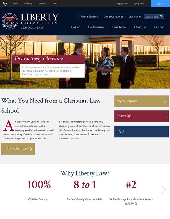
Desktop View of School of Law:
Mobile View of School of Law:
In this example, notice how in the mobile view the content stacks into a long and narrow view of the site so that it doesn’t go beyond the available width of the screen. Also, the navigation hides at the top of the page under the “menu” link so that it doesn’t clutter up the small screen.
Responsive Layout is Coming to Your Site
We will be helping and training you for transferring your site and will contact you before your site transitions to responsive, so don’t stress. But, you can start preparing your site now to make that transition easier. Here are some things to start with:
Conduct an Audit
An audit is a review of every single one of your pages. Doing an audit is a great idea so that we aren’t wasting time transferring pages to responsive that are unnecessary, have poor content, or are outdated.
Here’s how to create and conduct your audit:
- Open your page list in Web Manager
- Click the link for “Printable List” in the top left of the page
- Highlight the list and copy and paste them into an excel spreadsheet
- Then, open each page in Web Manager and make sure there isn’t any ROT (Redundant, Outdated, or Trivial content)
- If an entire page is ROT, note it for deletion (academic departments: you can send your list of pages to be deleted to the Web Team).
Tips for Creating Responsive-Friendly Content
- Remove tables in most cases. If you do use one, make sure to use percentages for width in Table Properties instead of set dimensions – and only use them for data (such as contact info), not page design/layout.
- Do not give images dimensions in Image Properties (you should leave the “width” and “height” boxes empty). See our tutorial for sizing images for the web.
As always, if you have any questions contact the Web Content Team. We’re here to help you!