Links and Buttons
If you want your audience to find, read, and understand your web content, you need to present it in a way that makes it easy for them. That means using the right words in your link text and button text. People come to your website to get information or to accomplish a task. They don’t come for a scavenger hunt or to read a novel.
With that in mind, here are some top tips when adding links and buttons to your site.
Use Descriptive Link Text
When you need information and you’re trying to get things done, the last thing you want is a mystery link. You’re on the trail of some information. You’re scanning headings and links. When you encounter a “click here” link, you can’t be sure where it will land. “Click here” has what’s called a low information scent, and it’s useless for visitors with visual impairments who rely on screen readers.
Instead, use link text that indicates what the link is for.
Don’t say: For more information on the admissions process, click here.
Instead, say: Find more information on our Admissions process.
Smashing Magazine provides more information on “Why Your Links Should Never Say ‘Click Here’.”
“Read More” or “Learn More” links have the same problem as “click here.” The link itself doesn’t indicate what the reader will read more about. If the user has read everything that precedes the “read more” link, then they might know what to find. But if the visitor only scanned the content, they may be lost.
Don’t say: Understand the expectations of WordPress Users. Learn more.
Instead, say: Understand the expectations of WordPress Users on our WordPress User Manual.
This Nielsen Norman Group article offers “Learn More” alternatives in case you need some help coming up with better link text.
Helpful links is the least helpful title for a group of links. All of your links should be helpful. Isn’t that why you have them? Instead, think about what really ties your links together and label them accordingly. You may discover that they don’t belong together at all. If that’s the case, try rearranging all your links into more meaningful categories or labeling them by audience.
Sometimes these phrases are difficult to work around. If you’re struggling, contact the Web Content team, and we’ll help you figure out solutions that better serve your content and your audience.
Opening in a New Tab
When creating links in your webpages in WordPress, by default the new page is set to open in the same window. When the user visits your page and clicks on a link, the view changes from the original page to the new view of the web page the link opened. If the user wishes to return to the previous page, they use the BACK button.
But there is also the option when creating links to have the new page open in a new window. Then there are two browser windows open – one with the original page and one with the page the link opened.
Which way is better? It depends on what you’re linking to.
In tests of user behavior, it has been shown that users prefer to use the BACK button when browsing. That way their desktop does not get cluttered with new windows. They can navigate back and forth through the web pages like the pages of a book.
From an accessibility compliance perspective, opening links in new tabs can negatively impact a site’s usability. Standard best practice is to open links in the same tab unless a user will need to refer to the first page in order to complete a task on the page in the new tab.
See Jakob Nielsen and Anna Kaley’s article Opening Links in New Browser Windows and Tabs for further explanation.
When to Use Buttons
Buttons are less about decoration, what looks good, and more about design and function, what works well.
It’s widely accepted that buttons represent an action, such as “Pay Now,” “Create an Account,” or “Save.” The action is more than just navigating from point A to point B. Instead, it tends to let the user do something based on user input. For example, clicking a “Buy Tickets” button should reserve a ticket for you, decrease the number of available tickets, and charge your credit card using the info you provided. That’s an action.
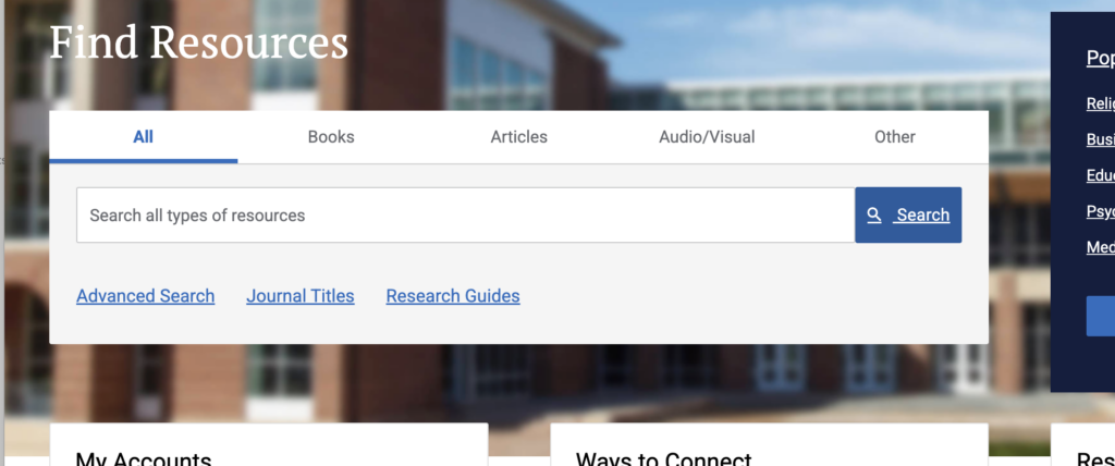
Take a look at the Jerry Falwell Library website. The blue “Search” button works here because clicking it performs a search (the action) based on your search terms (user input). The result is a custom search result page that didn’t exist before. On the other hand, a text link works best to access a pre-made page of Research Guides.
When Not to Use Buttons
Colored, underlined text is the most recognized visual cue for a link between two pieces of content or pages. It’s so common that users often ignore buttons in favor of text links. That’s why buttons don’t work well as page-to-page links.
If you’re not sure whether to use a link or a button, contact us via Teams or email. We can help you determine what works best for your page!